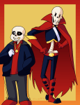
I did some redesigns for the underswap and underfell skelebros. I really like how the designs came out so I might be using them more in the future than the more commonly accepted canon designs. I still really like the designs for the FellBros, but I think my redesign fits better for my HCs about them.
Meanwhile. I never really liked the designs for the SwapBros. >>;; Sans’ design was fine, but Papyrus’ design was so. Absolutely nothing like him. If Sans got to keep the blue and grey color scheme why does Papyrus have to be orange and green/tan?
- Comment
- Reblog
-
Subscribe
Subscribed
Already have a WordPress.com account? Log in now.

